How to Design Android Pie App Icons That Meet Google’s Requirements
· 17 min read
Introduction: Why Android Pie App Icons Still Matter
When you open your phone, what do you grab first? Those little squares on your home screen. Your app icon is often the very first thing a user sees. It’s a handshake before they even open your app. And if that handshake feels off, they might swipe right past you. That’s why getting Android Pie app icons right still matters in 2026.
Back in 2018, Android Pie (API 28) introduced adaptive icons. This was a big change. Before that, app icons were static. Now, Android could shape them differently depending on the device. A Pixel phone might show them as circles, while a Samsung device might use squiggly shapes. To make this work, Google set clear rules about canvas sizes and safe zones. For example, the total canvas must be 108×108 dp, with a safe zone of 66×66 dp for your main design. The Android Adaptive Icons Guide explains this in detail. Even though years have passed, these same rules are still the standard today.
Why does this matter for you? Because consistency breeds trust. When your icon looks sharp and professional on every screen, users feel confident tapping it. Google Play also rewards well-designed icons. They help your app stand out in search results and category listings. Asolytics notes that following these guidelines is key for store compliance and better visibility. So, whether you’re building settings apps, productivity tools, or custom application software development projects, the same principles apply.
As a developer, designer, or software design architect, you need a clear framework to balance looks, technical rules, and performance. That’s exactly what this article gives you. By the end, you’ll know how to create icons that fit modern devices and meet Play Store requirements. And if you’re looking to strengthen your overall development skills, you might also enjoy this guide on certifications that actually pay off to boost your career.
Let’s dive into the details so your app makes a great first impression, every time.

Understanding Android Pie’s Design Language: Adaptive Icons and Their Impact
So what exactly makes adaptive icons so special? The magic is in the layers. Every adaptive icon is actually two separate images stacked on top of each other. There’s a foreground layer that holds your logo or main design, and a background layer that provides a solid color or subtle pattern behind it. Android then applies a device-specific mask on top, cutting the two layers into whatever shape the manufacturer chooses. A Pixel might round the corners, a Samsung device might use a squircle, and a OnePlus phone could show a circle. Your design stays centered and safe, no matter the shape. The Android Adaptive Icons Guide calls this the "safe zone" approach, and it’s been the standard since Android Pie.
Let’s talk numbers, because the dimensions matter. The total canvas must be 108 x 108 dp. But here’s the trick: the part you can actually see gets trimmed down to 72 x 72 dp on most launchers. You want your most important content, like your logo or key symbol, to live inside a 66 x 66 dp circle right in the middle. That’s the safe zone. Google’s own documentation says your logo should be at least 48 x 48 dp but never exceed 66 x 66 dp as confirmed by the issue tracker. The remaining area around the edges acts as a buffer so nothing gets cut off when the mask is applied. Asolytics notes that this visible area is key for making your icon look sharp on every screen type. And Staffbase adds that you should "mind the safe zone" and leave the outer edges free.
Now, why should you, as someone who might design settings apps or work on custom application software development, care about a 48 dp keyline constraint? Because that keyline is your friend. It helps you keep elements aligned and proportional. Think of it as a guide rail. If you place your main shape right on that 48 dp keyline, it will look balanced whether the final mask is a circle or a rounded square. This is especially useful when you’re an architect software design professional, where consistency across a suite of apps is critical. You don’t want one icon looking huge and another looking tiny just because they were designed without a standard.
Here’s a quick table to keep the numbers straight:
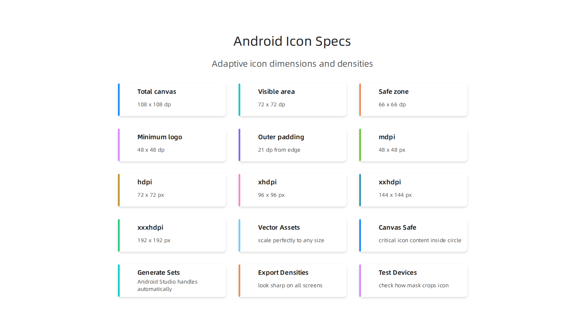
| Spec | Value |
|---|---|
| Total canvas | 108 x 108 dp |
| Visible area | 72 x 72 dp |
| Safe zone (circle) | 66 x 66 dp |
| Minimum logo size | 48 x 48 dp |
| Outer padding | 21 dp from edge |
To make your life easier, you can grab a ready-made template. The Android Adaptive Icons Template on Figma gives you the safe zone guides right in your design tool. And if you prefer to work directly in Android Studio, the Image Asset Studio can generate all the layers for you from a simple image or vector asset. Testing is also straightforward. Google even offers a codelab where you can preview how your icon will look on different launcher shapes.
Getting these two layers right and staying within the safe zone means your icon will work beautifully on millions of devices.
And if you’re designing settings apps or building any kind of custom application software development project, following these rules ensures your icon looks professional and trustworthy from the first tap. Once you master this structure, you’re ready to move on to the actual design process. So let’s talk about how to create icons that stand out while staying safe.
Core UI/UX Principles for Icon Design in 2026
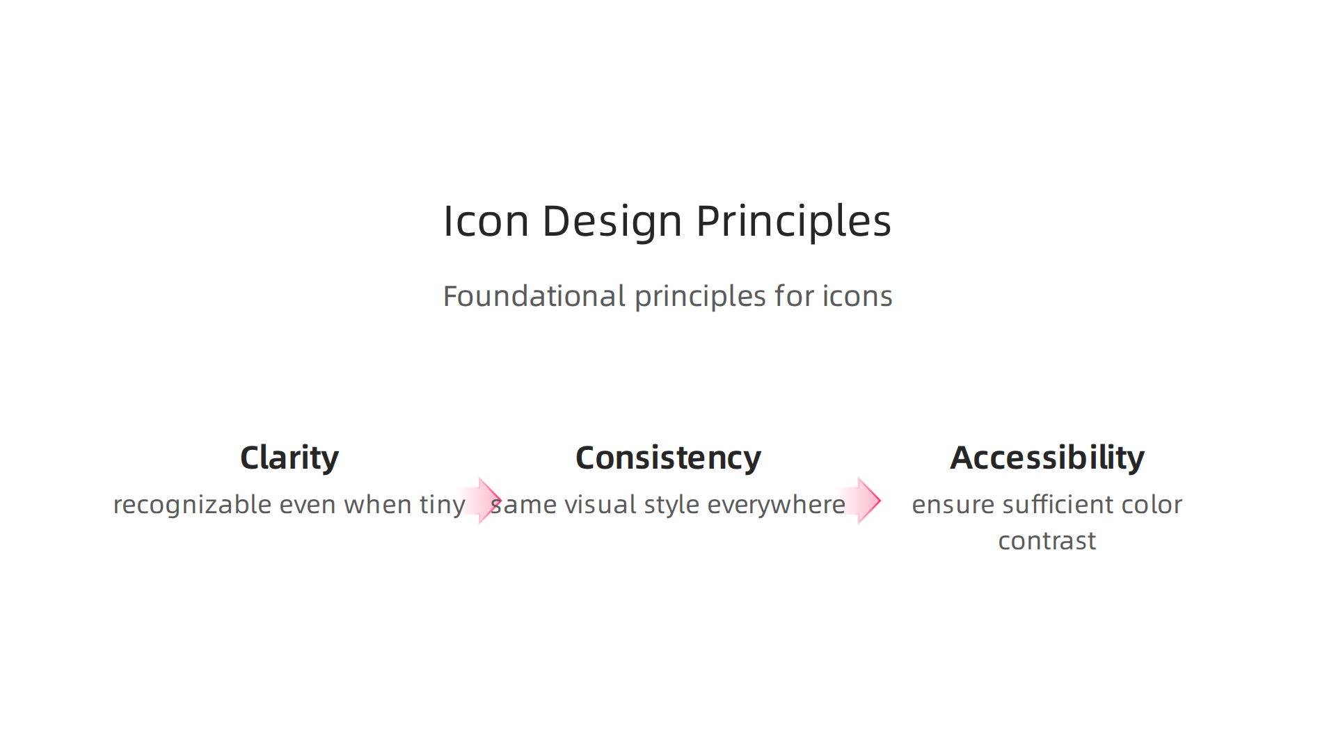
Once you wrap your head around the technical specs of Android Pie app icons, it’s time to think bigger. What makes an icon actually good in 2026? It’s not just about layers and safe zones. The best icons follow core UI/UX principles that help people understand your app instantly, every time they see it.
Let’s start with clarity. An icon must be recognizable even when it’s tiny. We’re talking about the 48 dp size that appears on most home screens and in notification bars. At that size, every detail matters. If your icon has too many small lines or complex shapes, it turns into a blurry mess. The same principle applies to the icons inside your settings apps. Keep your design simple. Use bold shapes and limit the number of elements to one or two. As one 2026 mobile UX guide explains, simplicity is the foundation of good app design because it reduces cognitive load and helps users find what they need quickly. UXCam emphasizes that mobile interfaces must be scannable and clear at a glance.
Consistency is next. Your app icon should feel like it belongs with the icons inside your app. If your launcher icon uses a soft blue gradient and rounded strokes, but your internal toolbar icons use sharp corners and flat colors, users will feel a disconnect. That hurts trust. Whether you’re designing for a fitness tracker or an architect software design tool, keep the visual style the same across the whole experience. Seedium’s 2026 design guide notes that a consistent visual language reinforces brand identity and makes navigation feel natural. This is especially true if you work in custom application software development, where you’re often creating suites of apps for clients.
Accessibility is not optional anymore. In 2026, designers must think about color contrast, stroke width, and how to communicate meaning without relying on color alone. For example, if your icon uses red to indicate an alert, make sure someone who is colorblind can still understand it. Add a shape or a symbol alongside the color. Also, stroke widths need to be thick enough to show up on small screens. A good rule of thumb is to use at least 2 dp strokes for the main outlines. The 2026 mobile app design best practices from theappmarket highlight that inclusive design expands your audience and actually improves usability for everyone.
These three principles clarity, consistency, and accessibility are the real foundation for creating Android Pie app icons that work.
They guide every decision you make, from the colors you pick to the shapes you draw. And if you want to dive even deeper into how to learn and apply these principles effectively, check out our guide on a science-backed framework for deep comprehension that helps you internalize complex design rules.
With these principles in hand, you’re ready to start sketching out icons that not only fit the technical mask but also feel intuitive and professional to every user.
Step-by-Step Guide to Designing Compliant Android Icons
So you understand the principles. Now let’s turn that knowledge into actual android pie app icons that pass Google’s requirements and look great on any device. Here’s a straightforward process that works for everything from simple settings apps to complex architect software design tools.
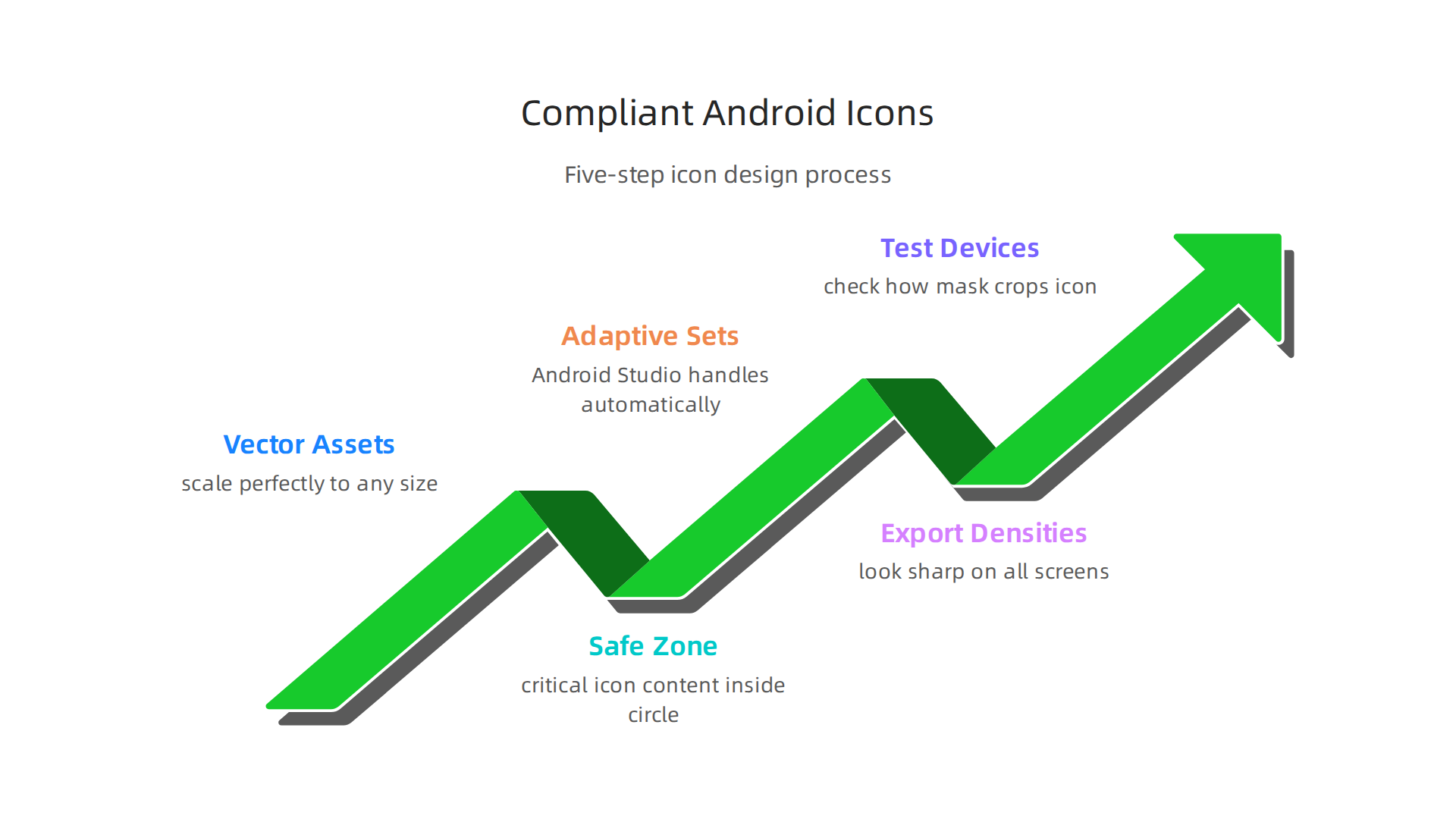
Step 1: Start with vector assets.
Always begin your icon design as a vector file. Use SVG or Android’s Vector Drawable format. Why? Vectors scale perfectly to any size without losing quality. You won’t end up with fuzzy edges when your icon needs to fit a 48 dp notification bar slot. Plus, vectors keep your file sizes small, which helps your app load faster. The Android Adaptive Icons Guide recommends starting with the correct canvas dimensions right from the start.
Step 2: Use the right canvas and safe zone.
Your total canvas should be 108×108 dp. But here’s the important part. Your critical icon content must stay inside a 66×66 dp circle in the center. That leaves 21 dp of padding on each side. As Asolytics explains, the visible area is the safe zone where your logo or main shape must live. If anything important goes outside that circle, it might get cut off on different devices. Google’s own issue tracker confirms this is the correct rule. Place your logo at least 48×48 dp but not larger than 66×66 dp.
Step 3: Generate adaptive icon sets with Image Asset Studio.
You could create every density manually. But that’s a lot of work and easy to mess up. Android Studio includes a tool called Image Asset Studio that handles this automatically. You just import your vector artwork, set the foreground and background layers, and the tool generates everything for you. It creates both the standard icon and the adaptive icon versions. If you’re doing custom application software development for multiple clients, this tool saves hours of repetitive work.
Step 4: Export all required densities.
Android devices come in many screen sizes and resolutions. Your icon needs to look sharp on all of them. You must export your icon at these densities:
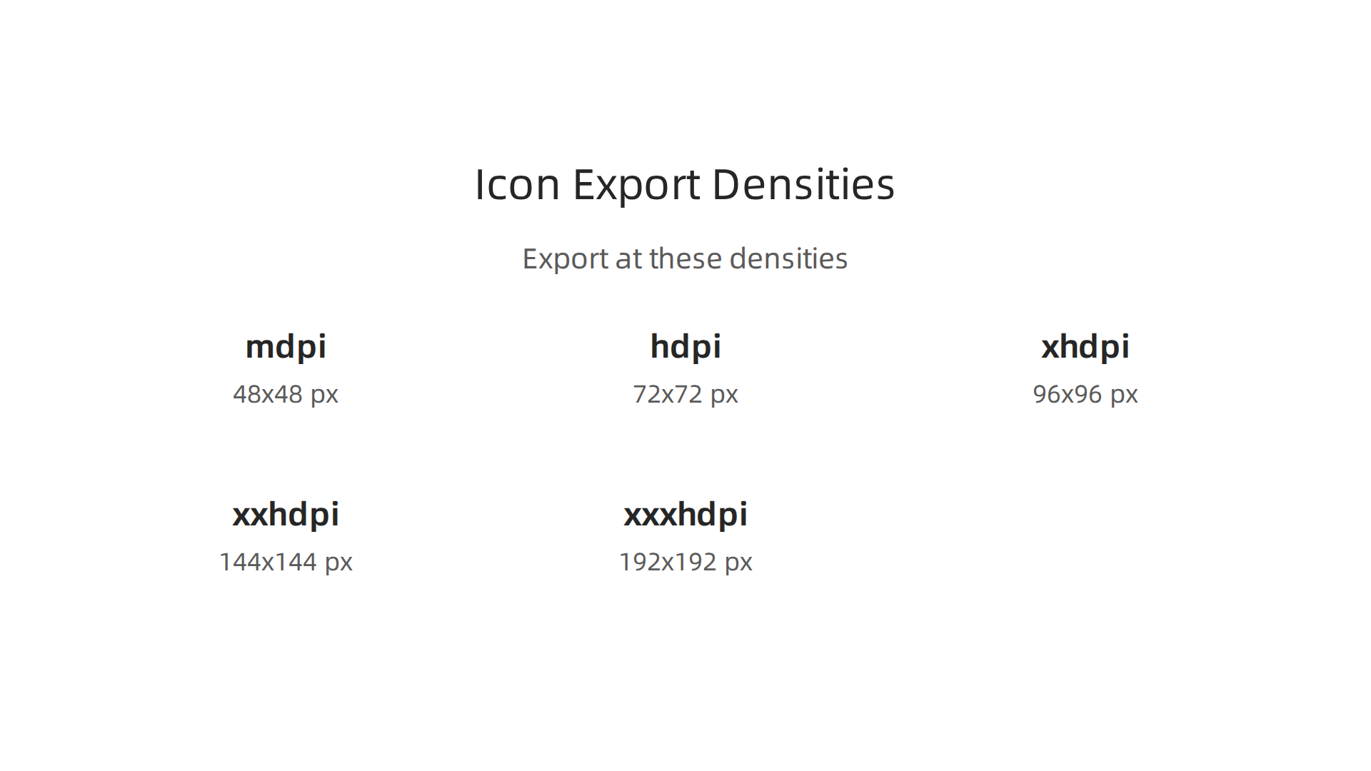
| Density | Abbreviation | Scale Factor |
|---|---|---|
| mdpi | 1x | 48×48 px |
| hdpi | 1.5x | 72×72 px |
| xhdpi | 2x | 96×96 px |
| xxhdpi | 3x | 144×144 px |
| xxxhdpi | 4x | 192×192 px |
The Google Codelab on app icons walks through how to test your icon across these sizes. If you skip any density, your icon will look blurry or pixelated on that class of device. That hurts your app’s credibility right from the home screen.
Step 5: Test on real devices.
Before you ship, test your icon on at least one low-end device and one high-end device. The Staffbase Support Portal reminds you to place critical content inside that safe zone and leave edges free. A quick test will show you if any parts get cropped. Also check how the icon looks on different launchers. Samsung, Google, and Xiaomi all handle adaptive icons slightly differently.
This whole process gets easier with practice. And if you want to truly master the why behind each step, our science-backed framework for deep comprehension can help you learn design rules so well they become second nature.
Follow these steps and your android pie app icons will meet Google’s standards every time. Whether you’re building a simple utility or a full software design architect suite, compliant icons make your app feel professional from the very first tap.
Testing and Optimizing Icon Performance Across Devices
You followed the design steps. You exported all the densities. Good. But here’s the truth: your icon might still look different on a real device. Manufacturers like Samsung, Google, and Xiaomi each use their own launcher masks. Some are round, some are squircle (a mix of square and circle), and some are square. If your icon’s key content sits outside the safe zone we talked about earlier, it can get chopped off. That’s why testing on actual hardware matters so much.
Test on real device masks and densities
Start by checking your icon on at least three different devices. One low-end phone (like an older Moto G) and one flagship (like a Google Pixel or Samsung Galaxy). Look at how the mask crops your icon. The Asolytics guide on Android app icons reminds you to keep critical elements inside the 66×66 dp circle. But even then, some manufacturers add extra roundness. Run your icon through Android Studio’s Image Asset Studio, then install the app on each device and take a screenshot. If anything looks off, go back and adjust the foreground layer.
You also need to test across all density buckets: mdpi, hdpi, xhdpi, xxhdpi, and xxxhdpi. The Android Developers documentation on reducing APK size explains that using vector graphics instead of multiple PNGs can shrink your app’s size significantly. That’s a win for both testing and performance.
Monitor how your icon affects app launch and APK size
Here’s something many developers miss. Large icon assets can bloat your APK. If you export a massive PNG for xxxhdpi, your app file could grow by several megabytes. That hurts download speeds and user patience, especially on slower networks. The Unity forum discussion on localized icons highlights that even small changes like adding localized icon variations can balloon your build size. Stick to vectors where possible. Use Adaptive Icons with foreground and background in SVG or Vector Drawable format. Your app will load faster, and users will thank you.
A/B test your icon for better conversions
Your icon is the first thing people see on Google Play. It’s also one of the biggest factors in whether they tap "Install." A small change in color, shape, or style can boost install rates by 10% or more. The Adjust blog on app icon best practices recommends running A/B tests on your icon before you launch. You can use Google Play’s in-app A/B testing tools or third-party services. Try two versions of your android pie app icons: one with a brighter background, one with a bolder symbol. Run the test for a week and see which one gets more clicks.
Testing doesn’t stop after launch either. You can revisit your icon every few months. As mobile app design trends for 2026 evolve, your icon might fall out of style. A fresh look can re-engage users who have your app sitting idle on their home screen.
Turn testing data into better designs
The results from your tests give you hard facts about what works. But interpreting those numbers takes practice. Want to make sure you’re reading test outcomes correctly? Our science-backed framework for deep comprehension can help you analyze performance data and apply findings to future icon updates. Whether you’re building settings apps or architect software design tools, treating your icon as a living asset that needs regular testing will pay off.
So don’t skip this step. Test on real devices, keep your APK lean, and let A/B testing guide your design decisions. Your android pie app icons will earn their place on millions of home screens.

Future-Proofing Your Icon Design: Trends and Best Practices
Once your icon is tested and works on all devices, you need to think about the future. App design trends change every year. What looks fresh in 2026 might feel old by 2027. Let’s look at the biggest trends and best practices to keep your icon relevant.
Trend 1: Minimalism and Soft Rounded Edges
In 2026, users love clean, simple icons. The 20 Mobile App Design Trends for 2026 report shows that soft, rounded edges make apps feel more approachable. Your android pie app icons should use simple shapes and one clear symbol. No clutter. This helps users recognize your app in a split second.
You might also hear about neumorphism. It is a style that uses light and shadow to make icons look soft and almost 3D. The UI Design Trends of 2026 from Tubik suggests that spatial UI, a cousin of neumorphism, will rise. Be careful here. A little shadow on your icon can make it pop. Too much shadow can look messy at small sizes.
Trend 2: Animated Adaptive Icons
Have you seen icons that pulse or change slightly? These are animated adaptive icons. They are a big trend in 2026. Check out this Top 2026 App Design Trends video to see how these small motions grab attention. Since Android introduced Adaptive Icons back with Android Pie, the format has kept evolving. Now you can animate the foreground layer. Just keep the animation subtle so it does not drain battery or feel annoying.
Trend 3: Dark Mode and Themed Icons
Dark mode is everywhere on Android. Your icon must work on a white background and a black background. The App Icon Guide for 2026 explains how to pass the platform’s Themed Icons requirements. You might need to create a monochrome version of your icon. This adds work, but it makes your app look like it belongs on the device.
Best Practice 1: Build a Design System
If you work on settings apps or do custom application software development, you probably create many icons. Don’t start from scratch every time. Build a library of reusable icon components. The App Icon Design Guide recommends using a consistent grid and stroke weight. This saves you hours and makes your icons feel like a family. When you architect software design systems, treat your icon set like code. Use vectors. Keep them in a shared folder. Update them in one place.
Best Practice 2: Plan for New Android APIs
Android updates every year. Sometimes the icon mask changes. Sometimes new layers are added. The Why Mobile App Icon Design Is a Growth Lever in 2026 article reminds us that staying ahead of platform rules gives you an advantage. Watch the Android Developers blog. When the API requirements for icons change, you need to adapt. This is why separating your content layers is so important. It lets you swap out the mask without redrawing your symbol.
Stay Ahead of the Curve
Future-proofing your icon is about more than just looking good. It is about staying relevant as a software design architect or developer.

Want to make sure you are constantly improving your technical skills? Investing in the right credentials can help. Check out our guide on The 2026 Software Engineer Certification That Actually Pays Off.
Icon design will keep changing. But if you follow these trends and best practices, your apps will always earn a place on the user’s home screen.
Summary
This article explains why Android Pie adaptive app icons remain important in 2026 and gives a practical, end-to-end guide for designing icons that look great across devices and pass Play Store rules. It covers the technical specs (108×108 dp canvas, 66×66 dp safe zone, 48×48 dp minimum logo), the two-layer adaptive structure, export density requirements, and testing on real launchers. You’ll learn core UI/UX principles—clarity, consistency, and accessibility—that make icons recognizable at small sizes, plus steps to generate assets with Image Asset Studio or Figma templates. The guide also shows how to keep APK size small with vectors, run A/B tests to improve conversions, and follow 2026 trends like subtle animation and themed icons. After reading, you’ll have a repeatable workflow and checklist to produce compliant, future-proof icons for settings apps, productivity tools, or larger software suites.